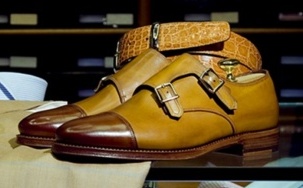
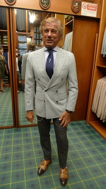
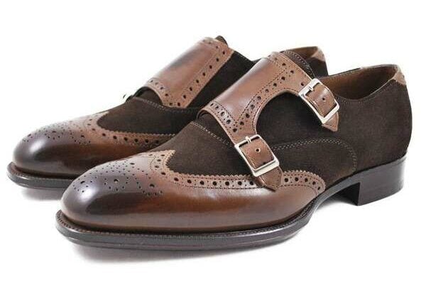
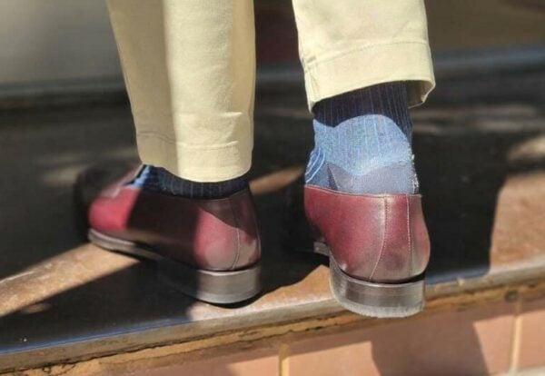
For those that don’t know who Lino Ieluzzi is, he is the owner of the famous shop in Milan, called Al Balzar, as well as one of the more popular faces seen on The Sartorialist. I would have never thought to do a quick post on Mr. Ieluzzi, but at the request of a reader, I figured that I would give my two cents on his infamous contrasted cap-toe monk straps that he is known for wearing. What I can say, is that I always appreciate someone who wears something that is unique and differentiates them from the rest. But, as far as these colors go, I would probably would have chosen them in other combinations. Not to say that these two colors don’t go well together, but just to say that they are definitely not my favorite. I do like them, however, and more so, appreciate Mr. Ieluzzi’s style in general, as I believe that he has a way about him that could be described as bravado, but in a good way. So what I am getting at, is that I do give my thumbs up on these shoes, but would want them in a different color combination. Your thoughts??

Terrific post Mr F. Thank you for doing it. I like the colour combo, but would like them in a sleeker with a more chiselled toe. A minor quibble however! Thanks again.
Mr F, I assume that you are always on the look out for new brands etc? I am not sure whether you have featured them before, but Francesco Begnigno may be of interest to you. I purchased a couple of pairs by them in Rome earlier this year. The ones are have are Berluti by any other name- they have a website should you be interested in featuring them. Best model imho is Roma.
These two colours definitely do not go well together.
The contrast leaves too much emphasis on the toe and not the straps, which is THE most important part on monks in my opinion.
Besides that, Mr. Ieluzzi style is indeed great, although I would have liked to see some cuff and not a “superstitious” number 7 tie (which he always seem to wear).
Cheers,
Everytime I think Italian, I always tell myself, “What Would Gianni Agnelli Do?”
Instead of the sharp contrast in colour, I would prefer a contrast in material, for example, tobacco brown suede with dark brown crocodile!
Hi,
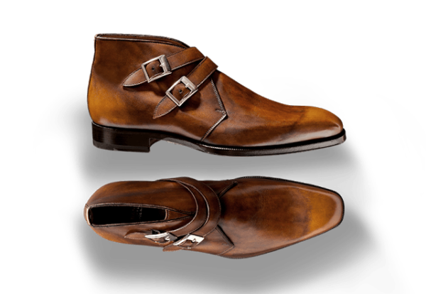
I polished a pair of these for a client last week, really loved them, the last is very round which is nice to see on a d-monk.
Best,
Christian
SJK – Thanks for the recommendation. Some where nice, but not completely to my liking. Glad that you enjoyed the post. Hopefully you got what you needed from it.
AFJ – Thanks for the input, will keep that in mind for my own designs…
Benjy – That would indeed be interesting to see..
Christian – Good to hear from you, hope that all is well down under.
-Justin